Grinders.golf · Design exploration
Three ways to make a golf society feel like a proper club.
These are working local previews, not flat mock-ups. Each direction is designed around the same eventual product: events, competition entry, live results, season standings, members, news, galleries and a committee/admin area.
Preview scope: visual direction and information architecture first. The final build can then turn the chosen direction into the actual society management system rather than locking us into the wrong look too early.
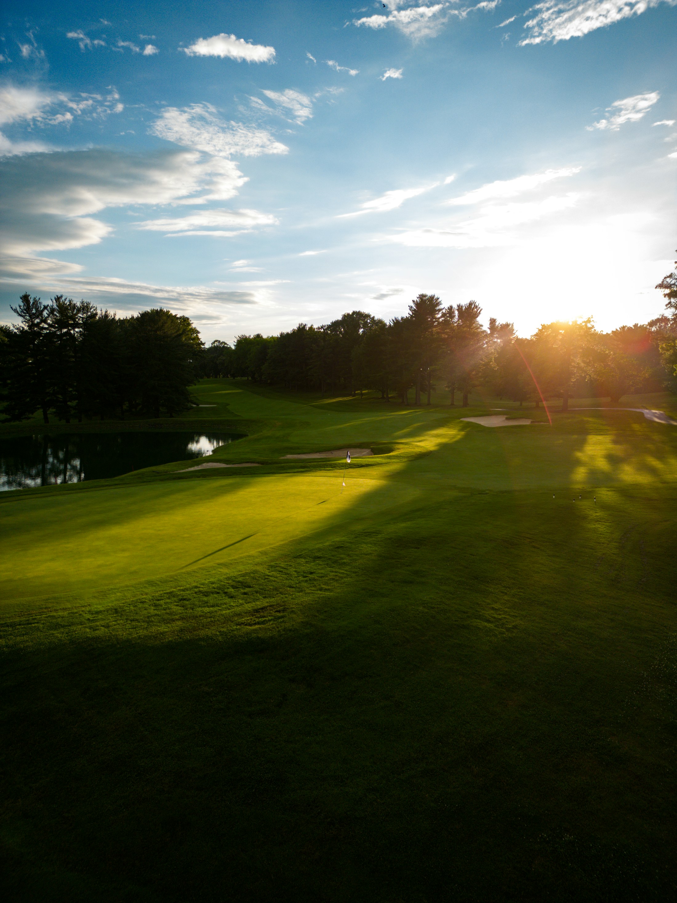 Direction 01
The Clubhouse
Premium, editorial and established. Feels like a golf society with history, but avoids the dated “country club WordPress theme” look.
Open full preview →
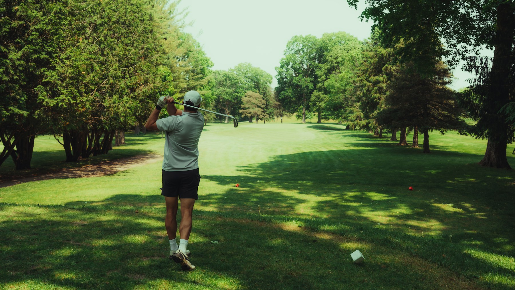 Direction 02
The Scorecard
Modern, bold and data-led. Gives competitions, leaderboards and season stats the visual energy of a contemporary sports platform.
Open full preview →
 Direction 03
The Away Day
Social, colourful and member-first. Better if Grinders is as much about trips, banter and the people as it is about the golf itself.
Open full preview →